Why waste a good chart?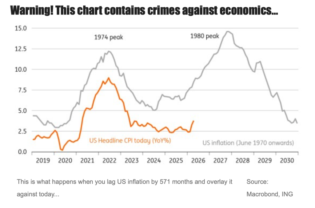
ING’s James Smith knows he has committed a tongue-in-cheek “crime against economics” with the above graph, addressing the inevitable comparisons between today’s outlook and the outcome of the 1970s inflation spike.
The similarities are striking, concedes Smith, but it doesn’t take long for the analogy to break down: “First, the shock itself. Even at today’s US$110 per barrel, oil prices in real terms are well below late-70s levels – particularly if you’re adjusting for OECD prices over the past 50 years.”
Secondly: “The West just isn’t as hungry for oil as it was back then,” notes Smith. “Per‑capita consumption is down by a third in the U.S. and over half in the U.K., and energy intensity has fallen with it. Electricity generation, meanwhile, has become a bigger slice of energy usage.”
There’s also the fact that central banks and policymakers will be keen to remember the lesson of half a century ago, notes the economist, and the fact that AI-driven productivity may meaningfully dampen inflation data.
“Historical parallels are neat and often irresistible,” Smith adds. “But no period is a perfect match. And today, despite the aesthetic similarities, it just isn’t the 1970s. Still, why let that get in the way of a good chart?”